DIZZY’S CLUB, JAZZ AT LINCOLN CENTER • RESTAURANT MENU RE-DESIGN FOR GREAT PERFORMANCES HOSPITALITY
Dizzy's Club is the world’s first venue designed specifically for jazz in 2004 by the Jazz at Lincoln Center team. It offers live jazz performances with panoramic views of the Manhattan skyline, a warm ambiance, and a delicious seasonal menu. Since 1987, the mission of Jazz at Lincoln Center is to entertain, enrich and expand a global community for jazz through performance, education, and advocacy.
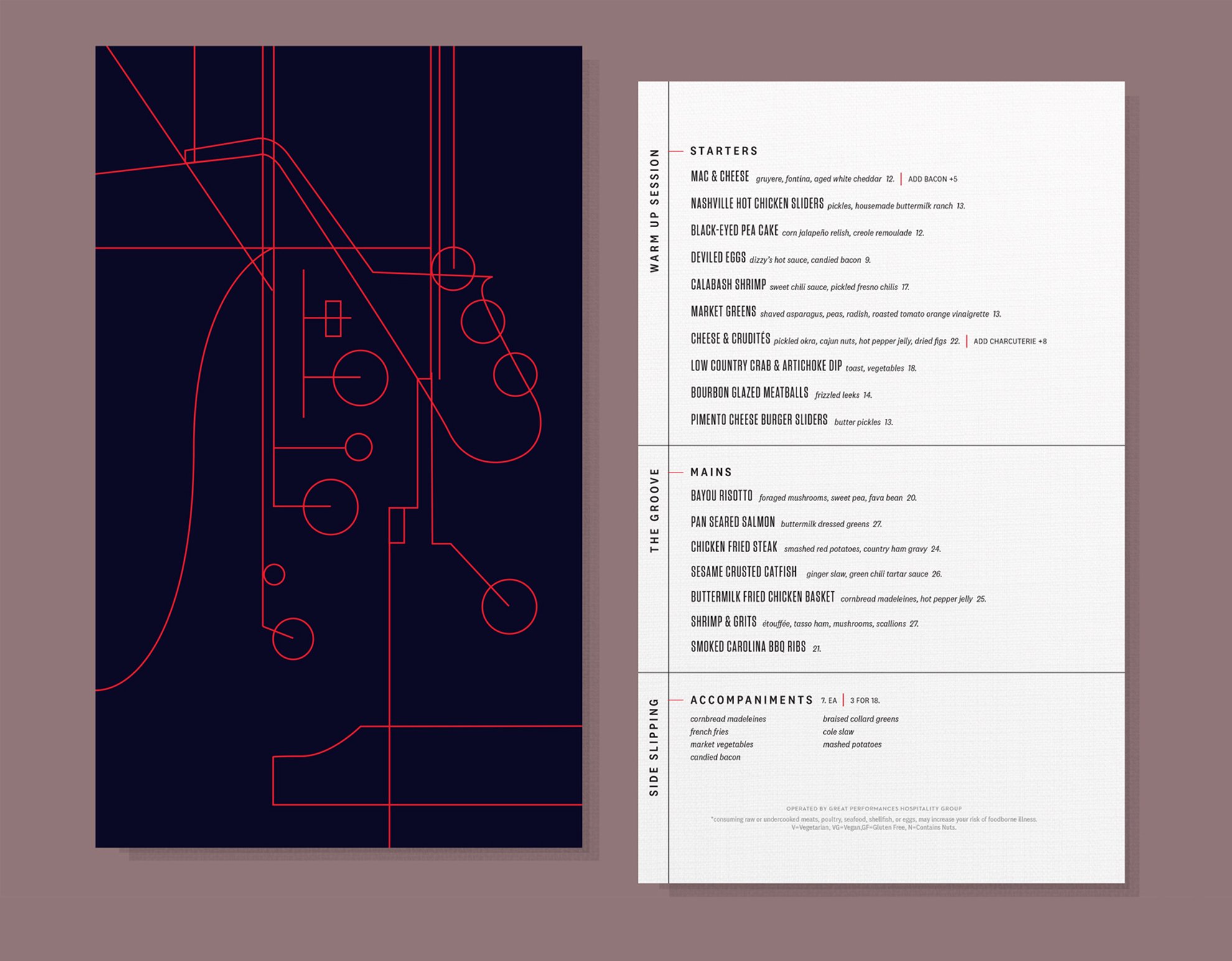
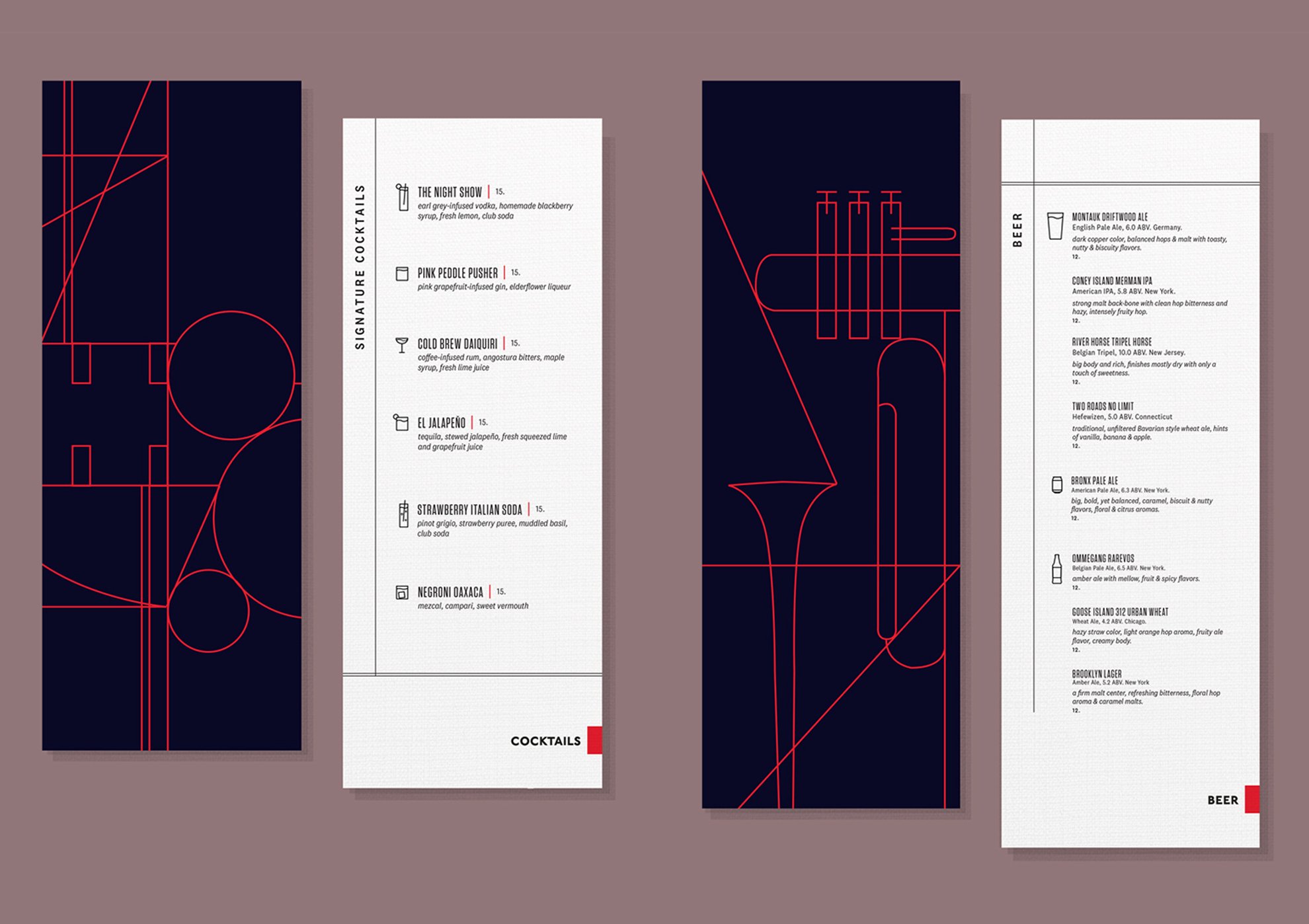
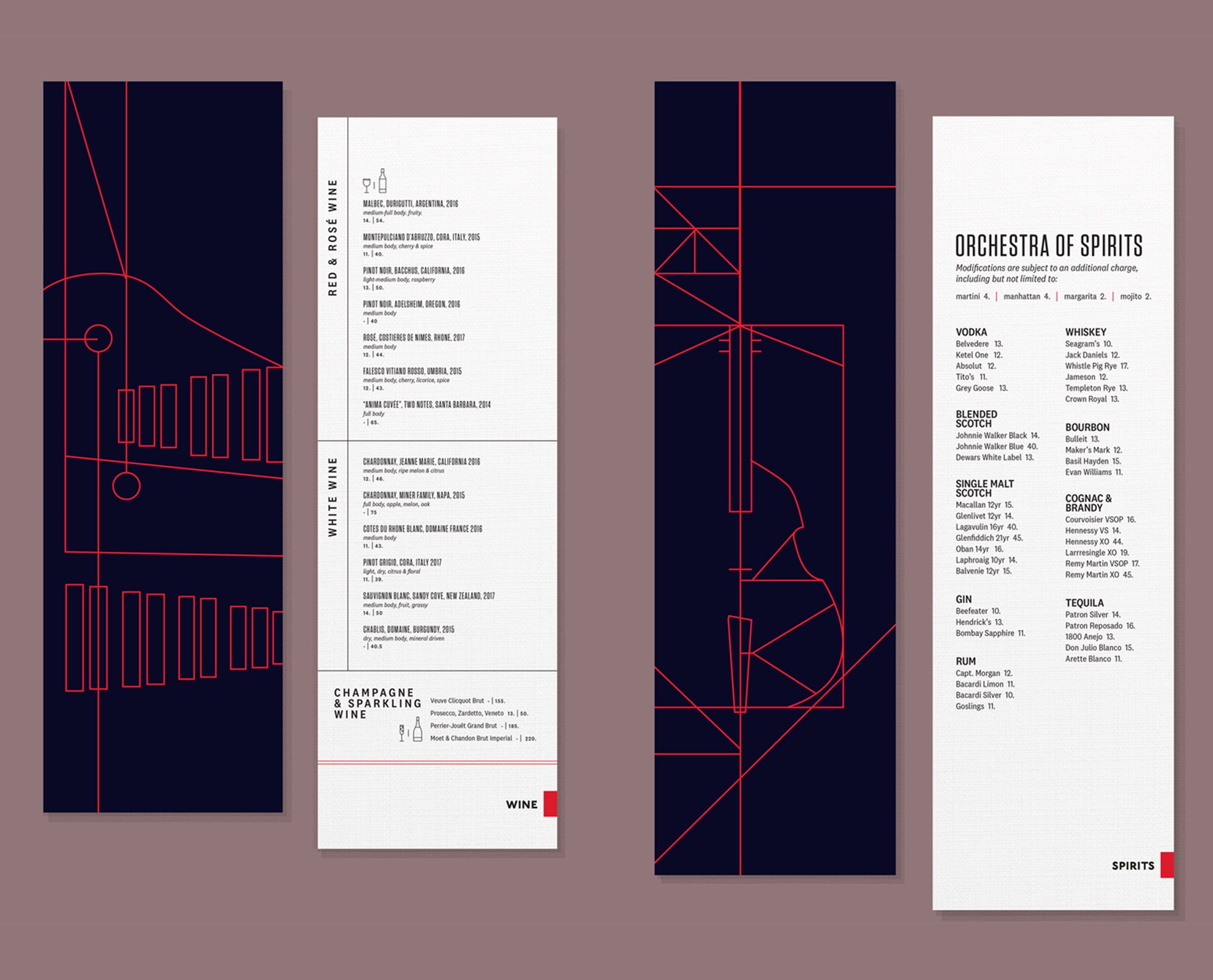
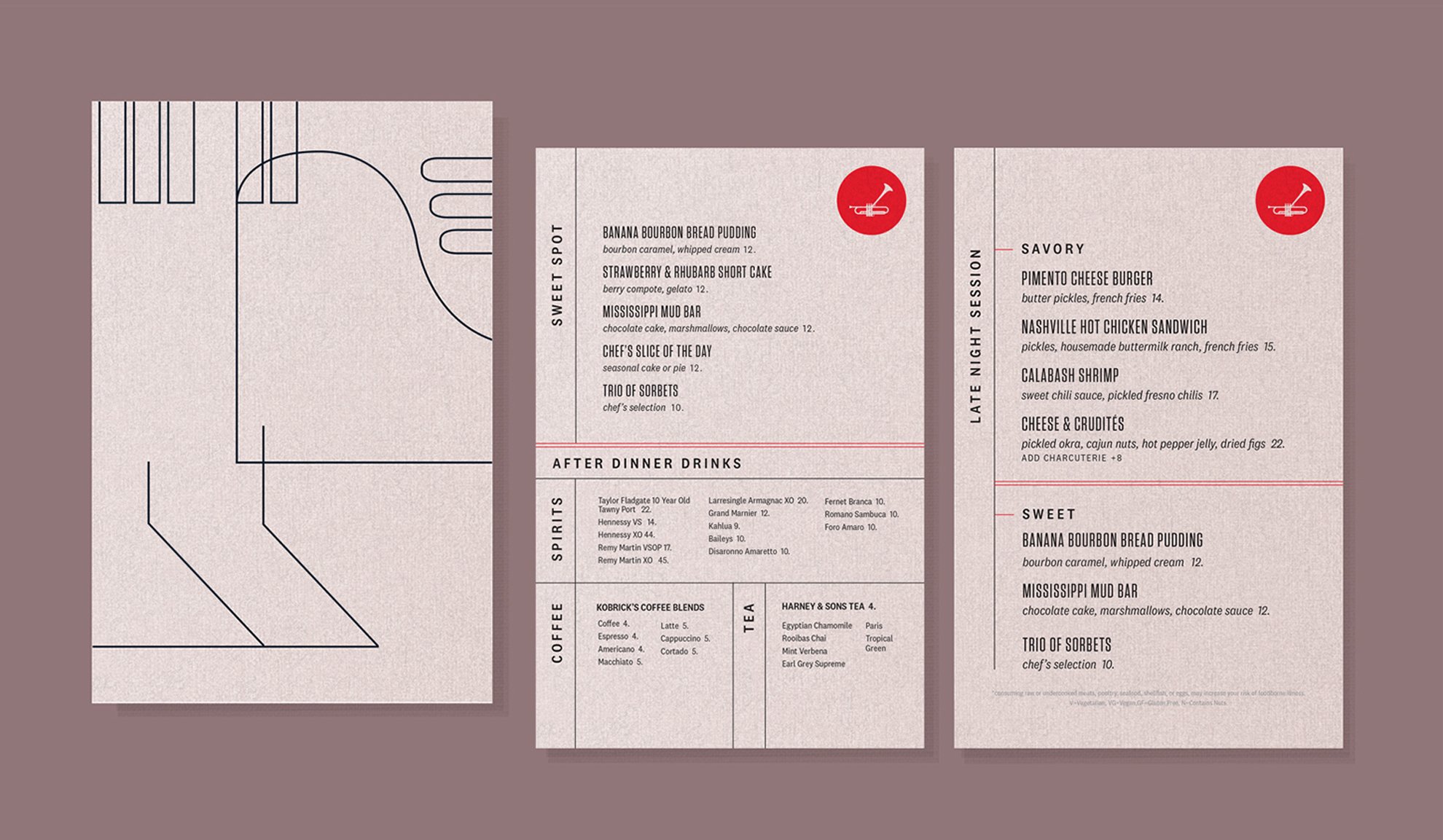
The custom abstract illustrations behind each double sided menu highlights a key instrument in jazz music, from the front line instruments carrying the melody to the back line carrying rhythm.
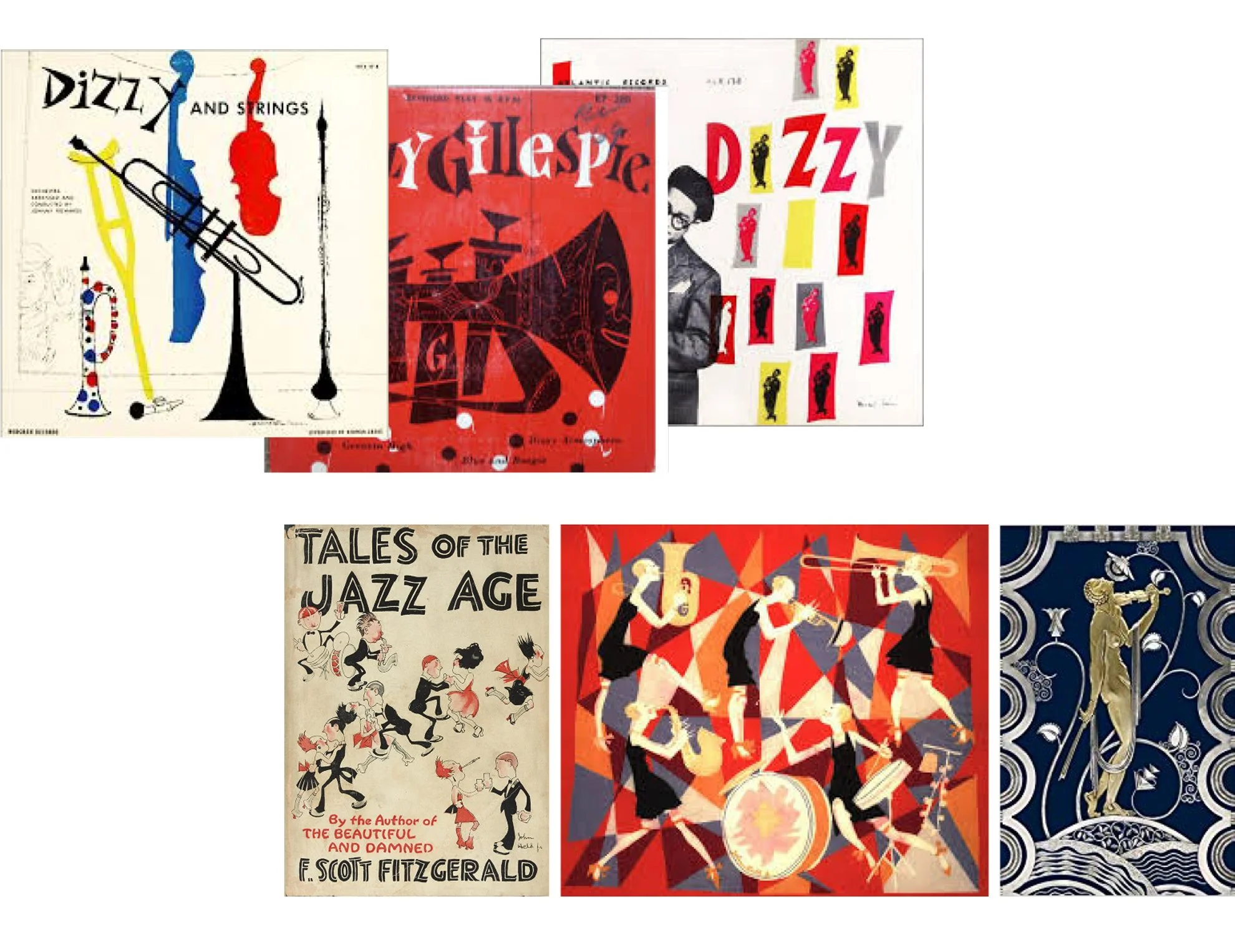
The abstract anatomy of each instrument is drawn in the style of art deco, a popular art style during the birth of New Orleans jazz in the 1920s. Inspiration for the menu illustrations are also inspired by the late Dizzy Gillespie’s album covers, a pioneering bebop/jazz musician, and the muse of Dizzy’s Club.
Just as each musician talks to each other through improvisation in a song, each drawn line connects and holds its own, embracing collective improvisation, one of the key features of jazz. Midnight blue Dizzy’s Club red, and pale yellow are used to evoke the opulence and freedom of the jazz age, the dimly lit speakeasy atmosphere, before stepping out into the bright moonlight.
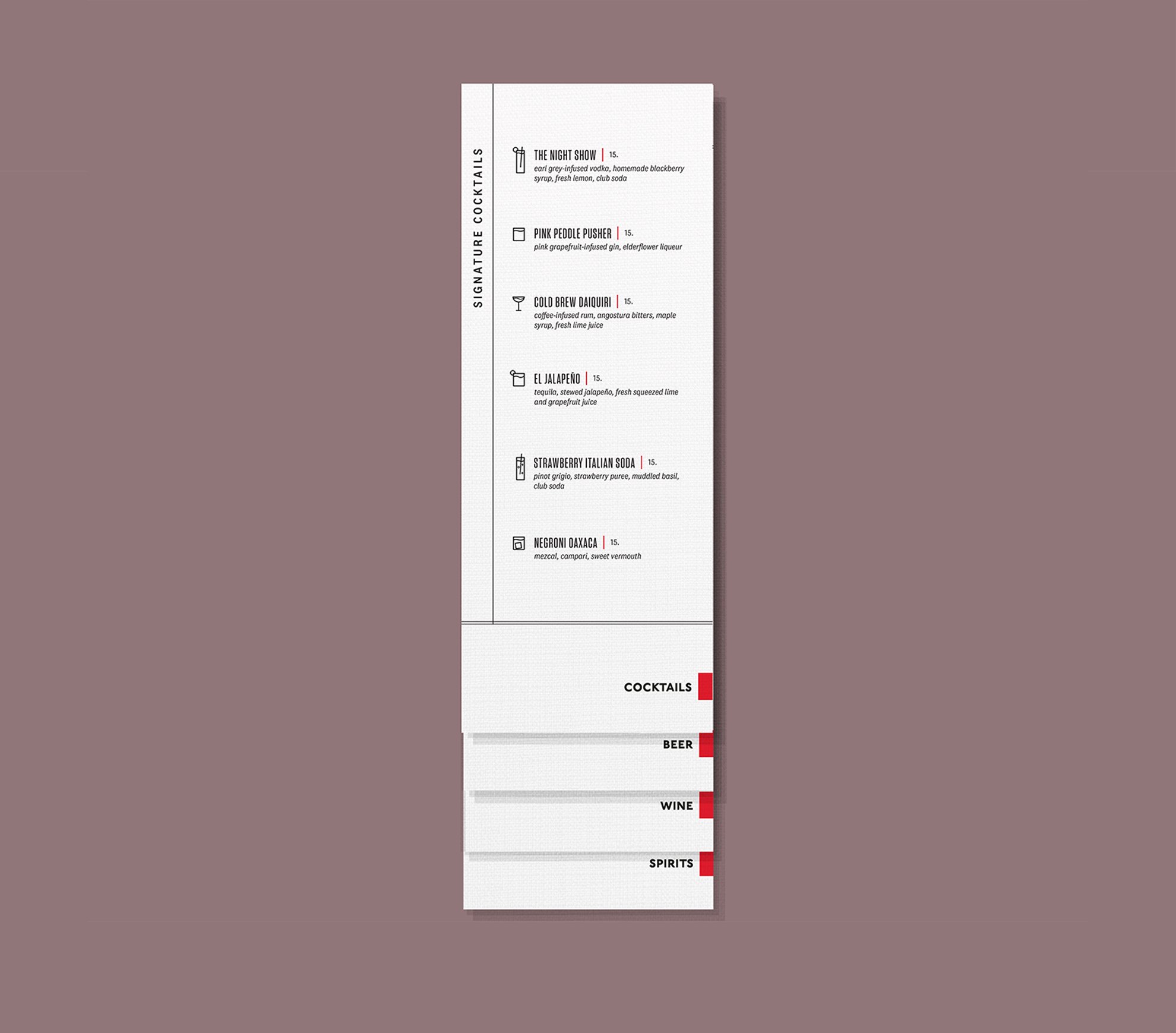
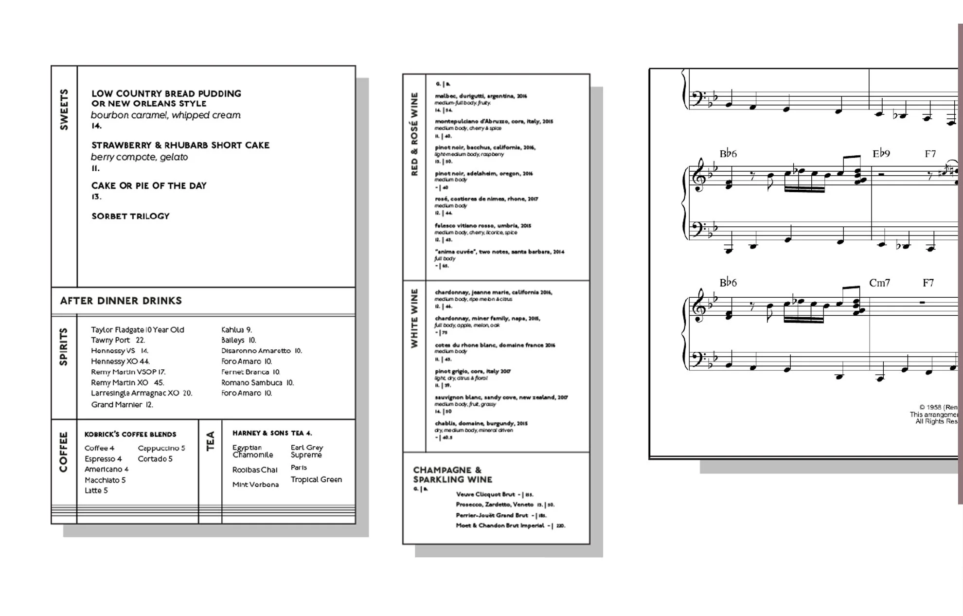
The use of vertical and horizontal lines references the visual layout of sheet music, minimalist and simple without losing the playfulness and intention of tying our design back to music. The linen textured paper we chose to print on also reminds us of sheet music.
One of the reasons why this project was particularly special for me to work on was because I had to opportunity to “phone-a-friend”, my middle school music teacher, Matthew Brian Ruddy.
For me, he is one of those teachers who you never forget, and his perspective on how music touches the world never left my soul. I’m grateful that we can connect and collaborate on creative projects years later! He made a short and sweet Spotify playlist of songs that reminded him of the foundations of Dizzy Gillespie’s style, and perhaps the soul of jazz itself.
While designing this restaurant menu, I would listen to this playlist on repeat at my desk. It helped me imagine how a guest would be experiencing this menu, from the feel of paper weight, color, and texture, to the way the typefaces would move across each page. Another shoutout to my talented cousin Chris Chew who is a designer, musician and typeface extraordinaire for your advice
