Since opening his first TIC restaurant in 1984, Mr. Bon Yagi and T.I.C. Restaurant group has introduced culinary destinations for everyone to enjoy Japan without airfare, each one unique in its authentic tastes and traditions.
The T.I.C. journey of Japanese cuisine and culture begins around East Ninth and Tenth Streets, is expanding uptown, and continues to grow throughout the food fabric of New York City.
________
Together with Sakura Yagi (COO) and restaurant staff, we transitioned every website from a flash/dreamweaver-heavy set-up to customized Squarespace sites. By collaborating directly with the General Managers’ personal experience nurturing their locations, we were able to also refresh the copywriting of each restaurant’s online presence with juicier menu descriptions, detailed origin stories, and a more intuitive flow of content.
This empowered each restaurant’s general manager to update their restaurant’s websites in real-time more easily and allowed them to focus more on their quality hospitality.
Below are select examples, you can view all 13 restaurants here! YONEKICHI
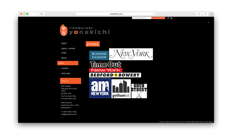
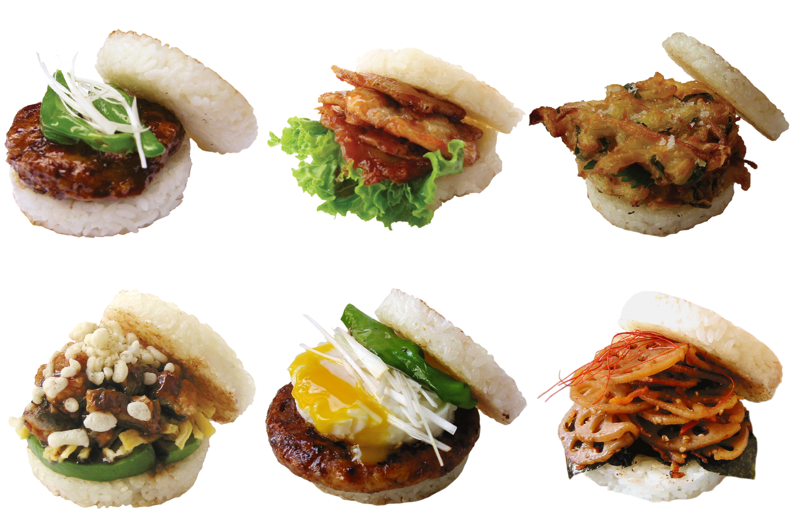
A lighthearted simple rice burger shop with lots of flavor. This website was lacking the color and creativity that the in-store experience had for customers. We changed the color palette, font choice, and scale of information to make it a cleaner and brighter visit to the Yonekichi site.
BEFORE
AFTER
CHA - AN TEAHOUSE
Tucked above and away from the hustle and bustle of NYC life, Cha-An is a haven for lovers of tea and Japanese treats. We re-designed the navigation and storytelling of the website to embody omotenashi (a Japanese term for whole-hearted hospitality) and celebrate Chef Norie Uematsu’s magical desserts. We simplified text and menus and organized information to “eat” “drink” & “visit” to show Cha-An does more than just dessert. Let the ingredients and visuals do the talking.
BEFORE
AFTER
CURRY - YA
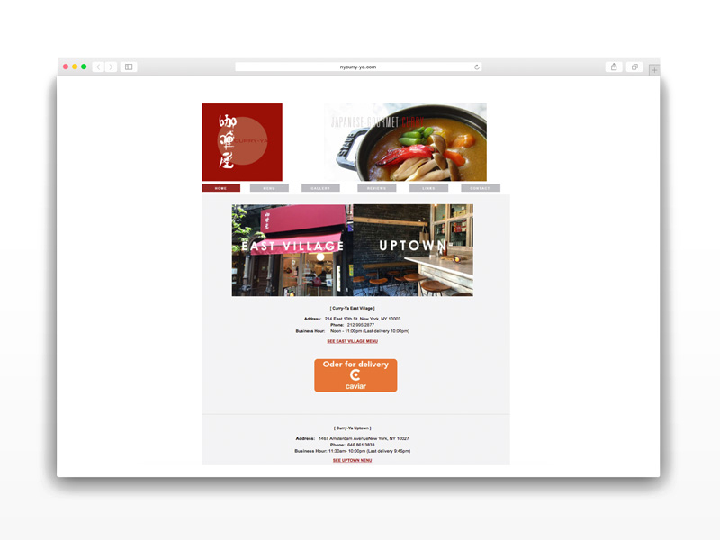
The goal of Curry-Ya’s re-design was to inform visitors about a multi-unit restaurant, and most importantly, educate eaters know about how Curry-Ya’s Japanese curry is different than other curries you’ve had before.
Inspired by the curry served at the Imperial Hotel in Tokyo, the new Curry-Ya website focused on local influencer recognition (it can be hard for people to understand why gourmet curry can be worth dining out for), origin storytelling from Mr. Yagi’s inspiration for opening Curry-Ya, and optimization for delivery orders in busy lunch crowd neighborhoods.
BEFORE
AFTER
SOBAYA
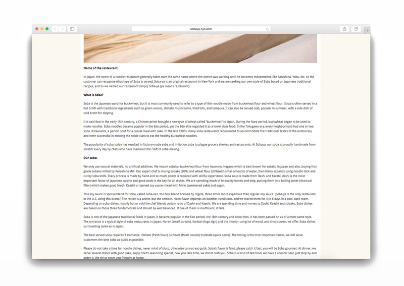
Education about soba noodles was a key element in how we re-designed Sobaya’s website. Sobaya shows passion and skill in their craft of making soba noodles in-house, and we wanted to share that with NYC. We broke down stories and process into steps to make it easier to digest, and more poetic to follow along.
BEFORE
AFTER
SHABU-TATSU
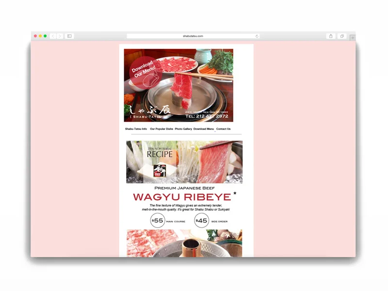
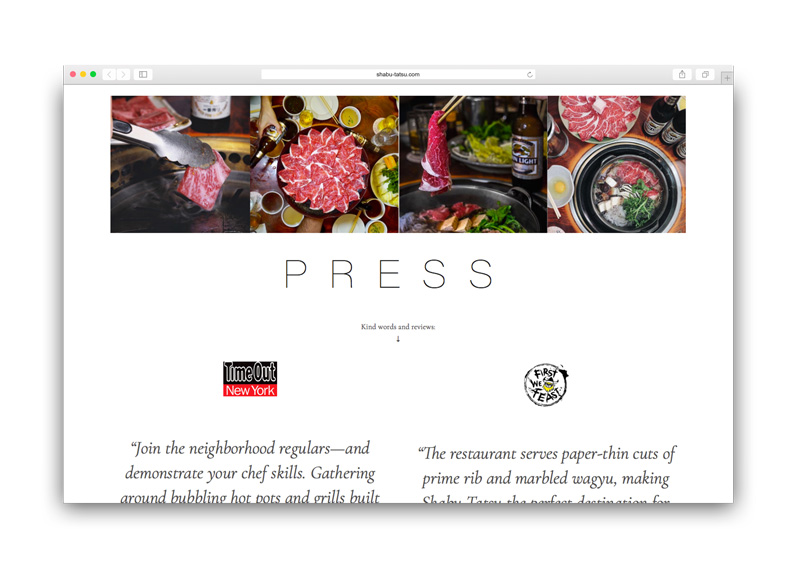
Shabu-Shabu is not your average hot pot experience. We redesigned Shabu-Tatsu’s website to help eaters better understand the elements of Shabu-Shabu dining through delicious copywriting and a more organized layout of information. This made it easier to learn about the menu, make a reservation, and get excited about visiting the restaurant.
BEFORE
AFTER


